Android Starting Window
文章目录

I will never say it out loud enough: always do overwhelm your users with your mobile apps. One of the most important way to mind-blow your users is to polish what is usually called the first impression. Indeed, the first impression is essential if you want to catch your users’ attention. Contrary to what most people think, this process doesn’t start at the first launch of your application. It starts way before this when your potential users are looking at your app’s description, screenshots, icons, reviews, etc. in the Google Play Store.
This is only after the user has downloaded and launched the app you can start thinking of gradually engaging her/him, presenting an awesome user interface, displaying a minimalist setup, etc. A recent study measured the importance of the first impression and determined 26% of all apps downloaded are opened only once and then never used again. Only 26% were used 11 times or more. Of the remaining 48% of apps: 13% are opened only twice, 9% are opened only three times, and so on. Regarding such figures, there is no need to tell how crucial the polishing of the first impression is if you want your app to survive in the “apps jungle”.
In this post, I wanted to talk about the exact point in time at which the user taps on an app icon and opens it: the app launching animation. It happens I have recently played with tons of apps completely screwing this part of the user flow. In order to help developers polishing their applications, I thought about introducing the issue, explaining in details how Android deals with app launching and finally fixing all of the potential glitches.
Introduction to the issue
Let’s take a very simple example to understand what I am talking about here: the built-in Calculator application. This app is rather simple and made of a single screen letting users write formulas and get the result of it. From a feature point of view, the Calculator application does what it is intended to. Unfortunately it doesn’t respect the previously described “first impression is all” rule.
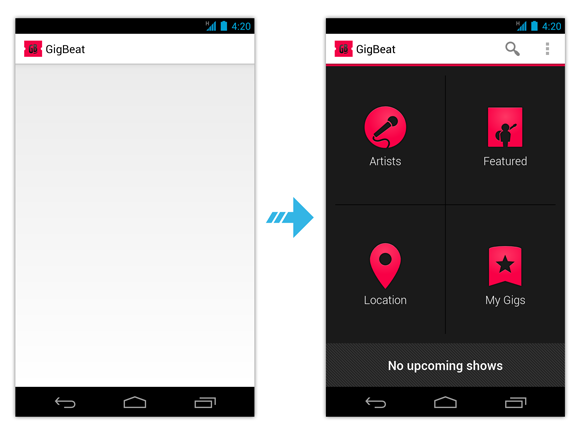
Have you seen something visually disturbing and/or jarring? I guess most of you haven’t noticed anything. Okay, I’ll be honest with you: the screencast example was intentionally hard. Here are some easier examples that respectively illustrate the launch of GigBeat and Facebook (the screen on the left is displayed prior the one on the right):

I guess you now clearly understand the issue. GigBeat and especially Facebook display an intermediate screen that is completely at the opposite of the final screen on the right. When I’m saying “opposite” I thinking in terms of appearance and contrast. From a user standpoint, it looks like the application is launching a useless screen to initialize something prior actually launching the main screen.
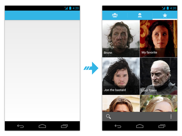
On the other side, some applications like the built-in Contacts or Messages applications do the launching the right way. Here are the screen flow I have when starting the Contacts app on my dwarf-dedicated mobile phone…

As you can see, the launching is perfect and gives the impression the app starts instantly by preloading a subset of the UI: the background color and the color of the ActionBar. Once the Activity is ready, the system fades out the temporary screen revealing the actual content of the screen. This technique makes app launching natural, continuous and smooth.
Understanding Android app launching
To fix this annoying issue we must first understand how Android deals with application launching. I believe giving all of the details would take a huge amount of time and I don’t think you need to understand every single detail of it so I will be as short as possible.
Starting a new application on Android basically consists on spawning a new process running an instance of a Dalvik VM. Once started, the Dalvik VM will, in turn, initialize a thread in which most of your code will be executed: the famous UI thread aka the main thread. Because initializing a process with a Dalvik VM from scratch may require a lot of time, Android relies on a trick called Zygote.
Curious people can go to the Wikipedia page of “Zygote” and will read the following abstract:
|
|
It may looks like this definition has nothing to do this Android but it actually do! Android’s zygote has been named after the term defined above. The Zygote technique used in Android consists on creating an initial process at boot time with a Dalvik VM. This instance preloads a bunch of classes, Drawables and ColorStateLists from the SDK and is used as the seed process from which all instances will be derived. Thanks to this technique, spawning a new ready-to-use process in Android simply requires forking the Zygote process which is way more efficient than creating a new process from scratch.
Zygote is an important optimization in Android because it minimizes the memory usage (on a copy-on-write basis) and reduces the amount of time required to start a new process. Although, application launching is blazingly fast, Android still require some time to load some data from your application (classes, resources, etc). In order to avoid hiccups and visually respond as soon as possible to the user interaction, the system displays a temporary window: the “starting window” also known as the “preview window”.
Pretty logically, starting windows are very basic windows that do almost nothing but displaying a minimalist UI. Starting windows are of type TYPE_APPLICATION_STARTING, are not focusable nor touchable and only displayed when the started Activity belongs to an application whose process is not started yet. As a result, starting windows are usually shown before actually displaying the Activity whose category is android.intent.category.LAUNCHER. However, due to the Android multitasking model, starting windows can also be displayed when restoring an Activity. In other words, do not consider starting windows as splash screens.
As described previously, the purpose of preview windows is to give the user immediate feedback that the app launched, but it also gives your app time to initialize itself. When your app is ready to run, the system removes the window and displays your app’s windows and views. As a result, none of your Java code is executed when the starting window is displayed. So how does Android know what my application will look like? In order to infer the design of the Activity, the framework uses the current Activity theme i.e. the theme of the Activity or the theme of the parent Application if no theme has been set to the Activity. Android inflates an empty but themed decor view (the base view hierarchy of an Activity), attaches it to a starting window and displays the latter on screen.
The perfect preview window
Now you have a clear overview of how Android deals with application launching, you can easily imagine what’s wrong with the Calculator, Gigbeat and Facebook apps. They are not correctly setting the theme. Even worse, all of these applications rely on the default theme @android:style/Theme or @android:style/Theme.Holo.Light and use their layout as the UI styling component. This is the reason why we see an intermediate design of the application (inferred from the theme) that is completely different from the second screen (the actual Activity).
So how can we fix the preview window issue? The first thing to do is obviously to create your own custom theme. As an example, we will investigate the built-in Calculator app because the code source is completely open source and available on GitHub. The Calculator app’s AndroidManifest.xml is given below:
|
|
As you can see, the Calculator app is made of a single Activity using the @android:style/Theme.Holo.NoActionBar theme. In order to modify some theme attributes, we will simply create a custom theme using the theme currently used by the Calculator app as the parent:
|
|
and use it in the AndroidManifest.xml:
|
|
The first way to avoid the preview window artifacts is to completely disable the feature. Indeed, although starting windows are enabled by default on Android, the SDK allows you to disable them simply by setting the android:windowDisablePreview attribute to true in your theme. Unfortunately, disabling preview windows also removes their main advantage: simulate an instant application launching. As a result, I highly suggest you not to disable starting windows unless really necessary (this is mostly only necessary in games based on Open GL ES).
The correct way to style a preview window is to make sure it best matches your Activity. In the case of the Calculator app, we will simply modify the background of the window to switch from the default gradient to a solid black color:
|
|
You can now kill and restart the Calculator app and notice that the preview animation is now in accordance with the Activity. The job was pretty simple, wasn’t it?
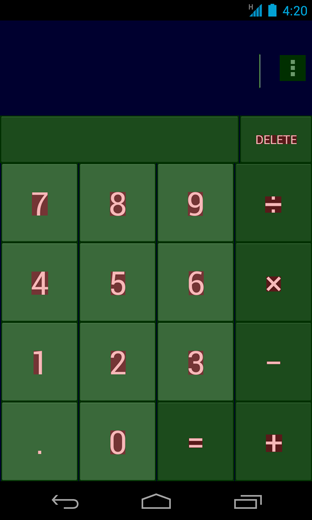
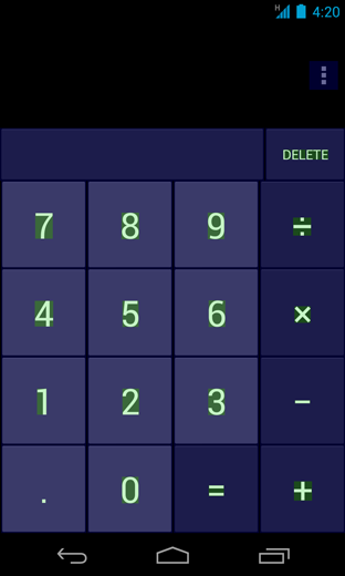
Thanks, to this tiny change in the code we now have a Calculator application with a nice preview animation. However, even if the result is visually correct, you can still enhance the rendering performance of the app. Indeed, let’s look for some potential overdraw. Enabling “Show GPU overdraw” in the developer options gives us the following screenshot:

As a reminder, blue means an overdraw of 1x, green 2x, light red 3x, etc. If you don’t know what overdraw is or how to measure and minimize it, please read the excellent documentation/reference on Romain Guy’s blog. Most of the screen being blue or green it basically means we are rendering too much layers on some parts of the UI. A rapid investigation on the layouts explains the issue. Indeed, all of the main.xml layout variants used a the content view of our main Activity are as follow:
|
|
It is now clear that the overdraw comes from the fully opaque black color drawn by the root LinearLayout as the background. While it was previously used to inefficiently hide the default gradient window background, it is now useless and can be removed.

Moving the background of your screens from the root of your layout to the background of your window is generally a good fix. Nevertheless, in some cases, the background of your window cannot be used as the general background and styling at the “layout level” is still required. In such as case, the trick consists on keeping a theme so that the system can infer the preview window of your app and change the background of the final window back to null in your Activity’s onCreate():
|
|
To conclude, you may still want to understand how the Contacts app displays a preview of the ActionBar. The answer to this question has been given above: the preview window is made of a themed empty decor view. The decor view is the hierarchy where lies the ActionBar. As a consequence, always style the ActionBar directly in your theme (see the documentation for more information) to have a nice and smooth application launching.
Conclusion
Starting windows may not be visible for a huge amount of time, they are shown at a crucial moment in the lifetime of your application. Hence, ensuring they correctly display a subset of your Activity UIs is vital. Polishing preview windows make your app fancier and smoother by removing all of the un-needed extra layers.
To finish, starting windows are great but must not be considered or used as splash screens. Do not consider preview windows as an excuse for publishing slow applications. They are clearly not intended to do that. They’re here to fake a fast launching while the system loads up your application process and make your app launch as graphically pleasant as possible to your users.
